This blog post is a re-post from May 19, 2015.
A new name to do a better job
If you’ve been paying particularly close attention over the past four months, you’ll know that we’ve been up to something with our friends over at With Company and SensesLab.
We knew back in January that we wanted to elevate our look and feel, and rebuild our platform with features optimized from all the lessons we’ve learned over the past year, but we were surprised that it would lead us to a new name.
Today we’re very pleased to finally unveil the first part of that change — say goodbye to JOBBOX.io and hello to Landing.jobs.
But why?
JOBBOX.io left us feeling a bit trapped. If you’ll forgive the awful pun, we wanted to think outside the proverbial box, not be confined by its walls and edges. We want to show we know it’s a process we can kickstart and bring to a happy conclusion; not a closed space you must contort yourself into.
Don’t get us wrong, JOBBOX.io was our baby, and we’re a proud momma. But our research and market exposure had shown us persistent issues with spelling, punctuation and domain availability for it, and as we continue to expand internationally, we also foresaw problems with similarly named companies. So we had to let it go. To fly the nest. It was time to land something else.
The recruitment process, especially in our sector, makes professionals feel like a line of code waiting to be parsed, rather than as a person with wants, needs and unique value — a value which is increasing as market demand outstrips supply.
Our new name is truer to what we’ve always set out to do — to connect the best candidates with the best jobs in tech. We’re the people behind YourFit, not the recruitment equivalent of that warehouse at the end of Raiders of the Lost Ark.
Sure we have business objectives, goals, metrics, analytics, but here at HQ, our favorite sound is the cowbell brought in to ring every time we get a new hire. We may be writing lines of code to help others get paid for doing the same, but it increasingly sounds like a pastoral farm here at the office.
We’re not a jobs board with banal listings that get posted and forgotten. We’re a motley crew of passionate individuals who know we can do a better job at finding you a better job.
The process
We’re not going to lie, this process took us way longer than expected, and it was a very emotionally charged one. White hairs and sore throats all increased in the first quarter of 2015, but Gandalf the White is way cooler than his Grey predecessor, so whatever.
Landing.jobs’ brand essence is a human way to land a tech job.
We’re not going to shove every new opening in your face as a job seeker, and we’re not going to besiege hiring manager inboxes with hundreds of applications. We’re aiming for more, often by going for less and always with one of us a click away to help you along the process.
We want candidates to take on bigger challenges than they face in their current gigs. We want employers to realize they’ve got to up their game to find the best talent. We want to bring them together and make magic happen.
The look and feel
In most iterations, our logo is boldly simple and highly legible in its well-spaced capital letters, granted dignity by its firm underline. Uh-huh.

But there’s also a playfulness in some iterations we’ll be rolling out, where the letters dance or are disjointed from their “landed” position along a grid, as you can see above. We love to shake things up ourselves, and in the lives, we change every day. But we’ll land you back down. You’ll see more of this in campaigns and print in the future.

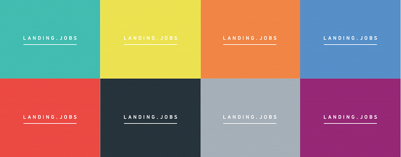
We’re also bringing a lot more color to Landing.jobs, which carries over some of the pistachio green we’re all so fond of and … wait, is that a rainbow? Yes. Everyone has different expectations, skills, and motivations. As do our tech professionals and the different companies that seek to employ them. A color palette that reflects this diversity, and breaks through the blue-or-orange schemes of our competitors is a nice touch and gives us so much more versatility as time goes on. Plus, it’s pretty. And, while we’re at it, there’s no harm in standing up for gay rights, especially in tech.
A final element is the underscored L, perfect for icons, avatars, profile pictures. If you’re lucky enough to get a job through us, you may even get your own underscored J.
So what now?
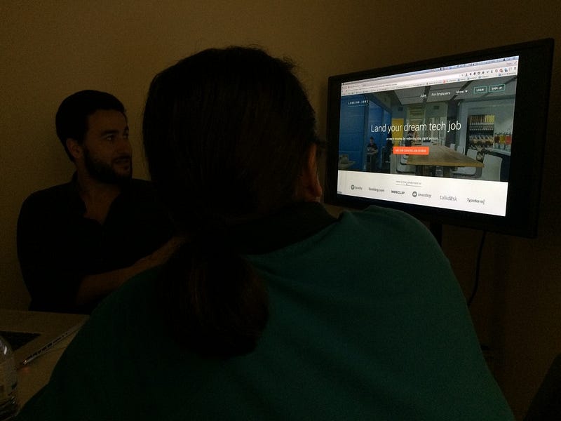
Well, a lucky domain purchase means you can now find everything you loved about JOBBOX.io at Landing.jobs. For now, we’ve reskinned our existing platform and properties with the new identity as Version 1.5 (which also comes with a new, simplified pricing model for employers), but Version 2.0 is just around the corner. Here’s a sneak peek of what Gustavo and the team at SensesLab are working on for that:

Aim for more,
The Landing.Jobs Team
