Communication is key in a recruitment process. It’s the beauty of exchanging ideas and expressing opinions between two (or more) humans. It’s the way you create empathy and get to know the other person’s perspective over the world. Above all, during the recruitment process, it’s how both candidates and companies can assess if they’re a fit for each other.
This left our Product Team wondering if we were actually providing the best tool for this purpose. Naturally, we identified the points that had to be improved and we decided to rethink the whole thing! But more than explaining our motivations for this project, we’d like to share with you how it was designed and what new features you can now enjoy. Curious enough? Let’s do this!
First step? Pinpointing each one of the issues our users were facing:
1. We were snail-paced
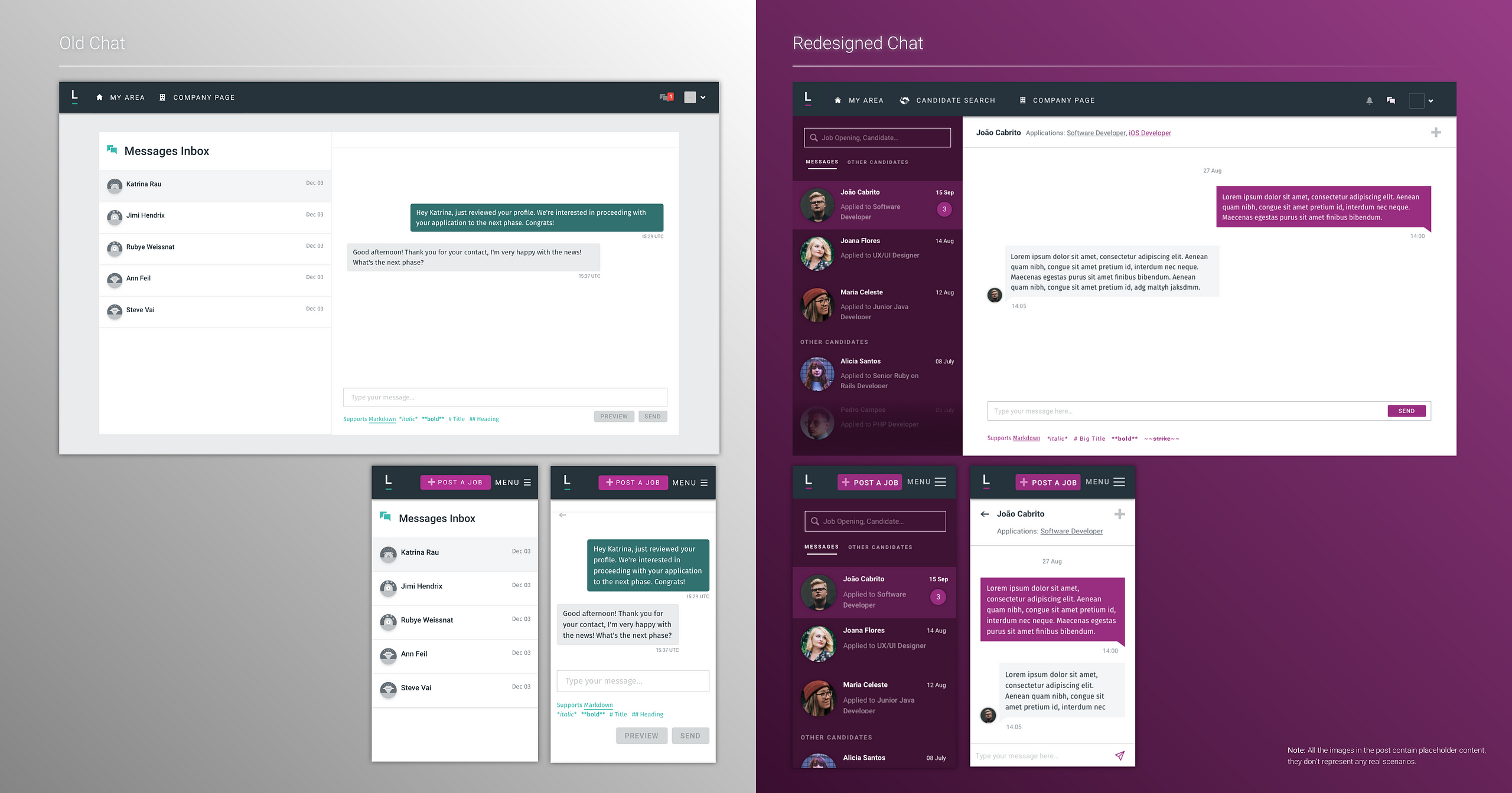
Our chat didn’t allow instant messaging, this meant that although we called it a “chat” in all our buttons and interfaces, it was more like a webmail running on a Windows XP.
2. We forced users to perform mental time travels
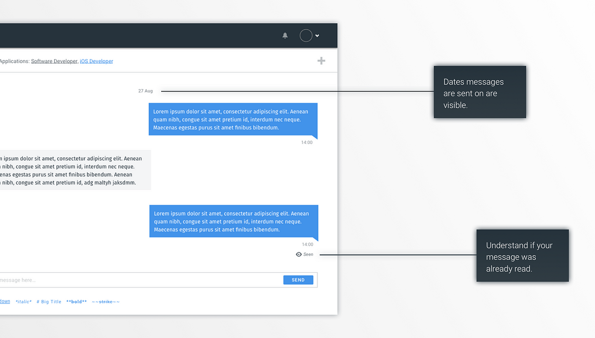
There was no indicator on what date the messages had been sent. It could have been 2 days, a week, or even a month ago.This was definitely an issue we had to fix because dates, and specially due-dates, are an essential part of the recruitment process. A great example of just how important it is would be an employer trying to determine if a candidate’s tech assessment was submitted within the deadline, without being able to see the date it was sent. Tough, right?
3. We organised peddy papers for candidate profiles
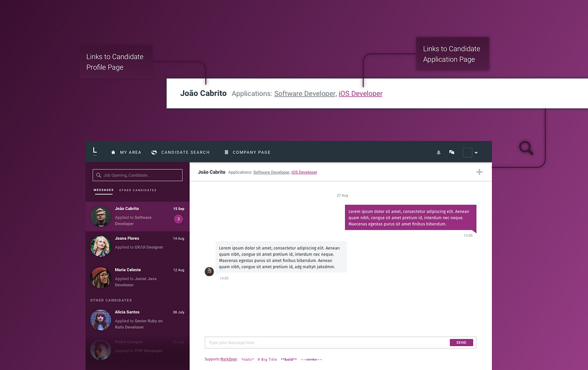
With no names, application titles, or handy buttons, employers had a real hard time finding the information they needed most during the process: the candidate’s application and profile.
4. We savored the concept of “the more the merrier”
Instead of having one conversation per candidate, a new chat window was created between parties every time there was a new application. This meant that, if the candidate applied to 5 different positions in one company, an employer could have 5 ongoing conversations with the same candidate.
5. Our design was stone-aged
As the rest of our platform evolved, well, our chat didn’t. It had nothing to do with our new style guide and front-end components, it was completely deprecated. In UX Design, functionality and aesthetics go hand-in-hand, one cannot thrive without the other and that’s why we decided it was time to fully revamp the user interface of our chat!
Second step: Design the features that would make a difference
1. Our Chat became (a)live!
Instead of having to hit the refresh button to view new incoming messages, users will now instantly receive the messages without that extra click. Poof!
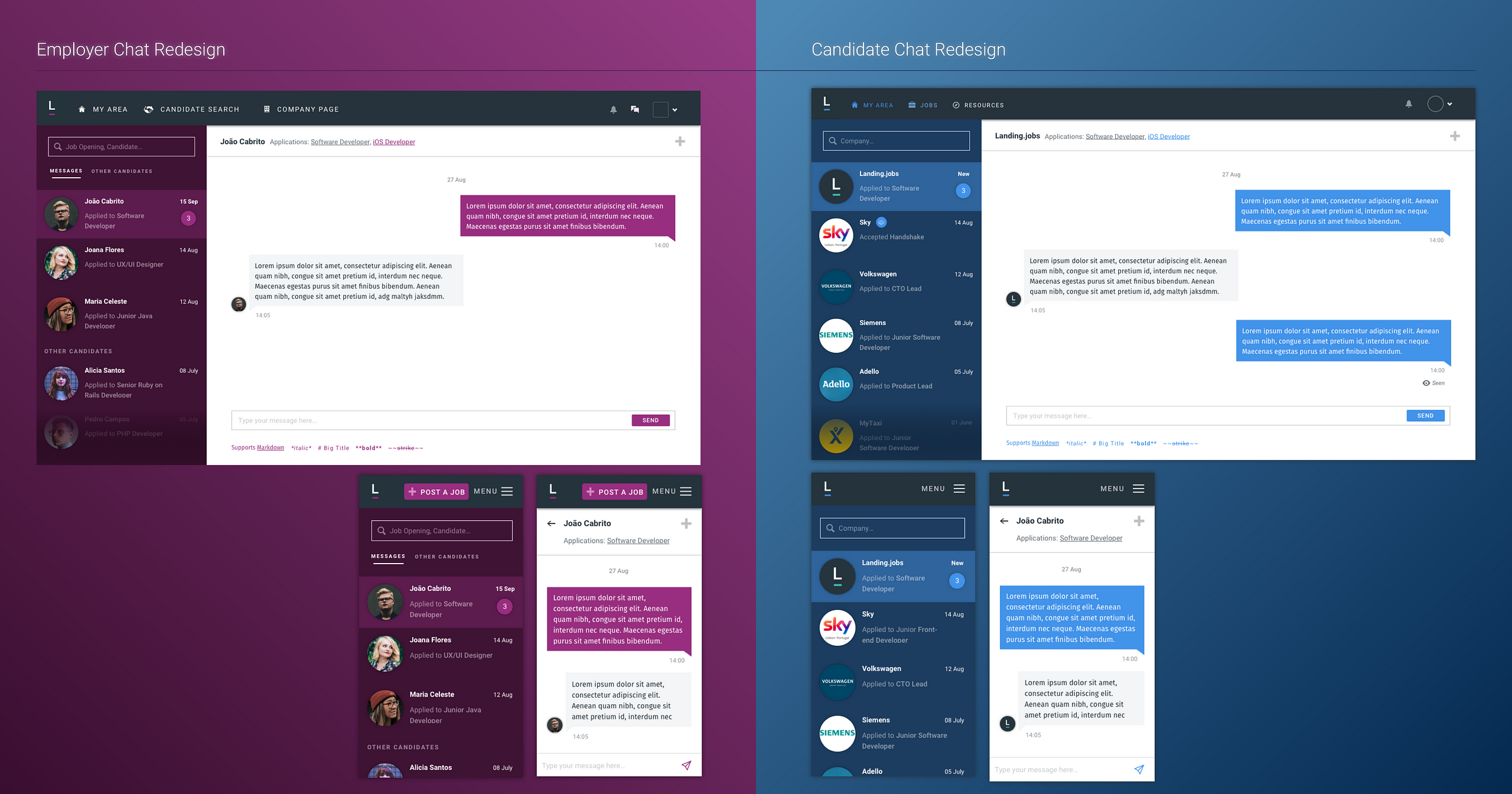
2. The information you need where you need it
Access to the candidate’s profile and application page are now one click away. Recruiters often need to check the candidate’s profile and application page several times while chatting therefore, to keep information available and accessible at all times, we made sure it was right were they need it.
3. Contextual chatting
Instead of having various chat conversations contingent on an application, we inverted the logic and made it possible to sum up everything in a single chat. Now recruiters can have one single conversation with a candidate, being able to view, on a second information level, all the applications made.
4. Modernise the design
We adapted the chat design to our new style guide, uniformising the visuals throughout out product. Colours, font-sizes, and hierarchies were pixel-perfectly designed in order to make the user experience the most pleasant possible.
5. Adding the “Seen” feature
Both employer and candidate users will now know when they sent the message and if it was seen by the other person. This enables both groups to measure commitment and engagement. If the seen symbol appears after the message, then you’ll know it has reached its destination.
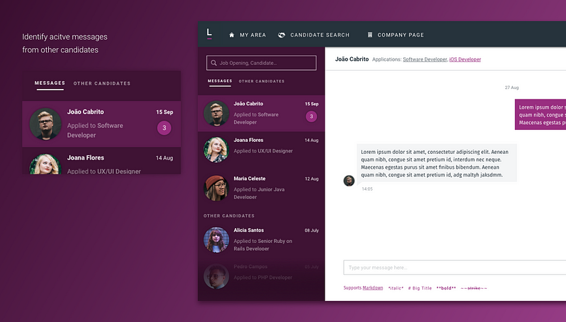
6. Categorising conversations
Employers are now able to switch between message types: their active “Messages” and “Other candidates” with whom they still haven’t started a conversation with. Just so they can keep it tidy!
7. Having the chat always available
Before this redesign, users only had access to the chat page when they had an ongoing conversation. Now, they’re able to travel to that page anytime they feel like, even if they don’t have any ongoing conversation. This is important so that when new users sign up and explore our platform, they can quickly find out about the chat’s existence.
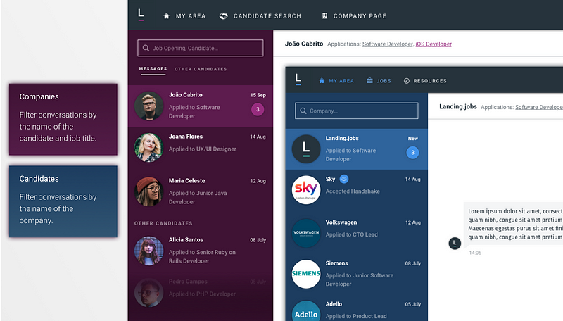
8. Smoothly finding what you’re looking for
We added search inputs so that users can easily find the candidate or company they’re looking to interact with. Employers can search by candidate name or job title and candidates can filter by a specific company. This way, everybody can save some time and start chatting right away!
What are we trying to impact?
We believe that by designing and building useful tools for our users, we’ll empower their skills and efficiency. Having a chat that meets our users needs and, simultaneously, gives them a pleasurable experience, makes us want to keep aiming for more and continue developing a product that, not only enables users to recruit and get hired, but also supports a relationship between employer and candidate based on trust and open dialogue.