
Fascinating!
Following up on the changes we started with Captain Kirk last month, we decided to #AimforMore. Every captain needs a second officer, and Captain Kirk was aching for some Vulcan help.
This week, remaining faithful to our film addiction, we have just released the new “Mr. Spock’s Applications Screen”, with an all-new design and great new features for our Employer Dashboard.
Our old Applications Screen was getting a bit too Human for our taste, so we decided to give it a Vulcan upgrade. We’d love to call out some of the bigger features that have rolled out with this release and let you know how you can best take advantage of them!
TL;DR > New Features:
- Applications Screen… looks good, feels even better
- Candidate Review Screen… proper one pager on each candidate
- Reviewed Hiring Process… simple answers to complex problems
- Export to ATS… still in progress… almost there
Applications Screen
Looks good, feels even better
Our applications screen was clearly getting a bit outdated, even for a human, and lacking some structure and visual hierarchy, making it really hard to grasp where to focus next. On this new version, we tried to simplify it and give it some visual cues on what to do next.
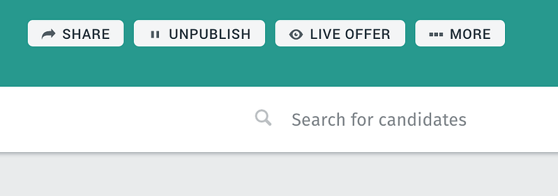
Up on the header section, in teal (how I know that colour, I can’t even begin to fathom), you have some info about the job offer once more, and all the main actions that were also available in the main employer dashboard. Context is always kept and if you want, you can always go back to the dashboard.
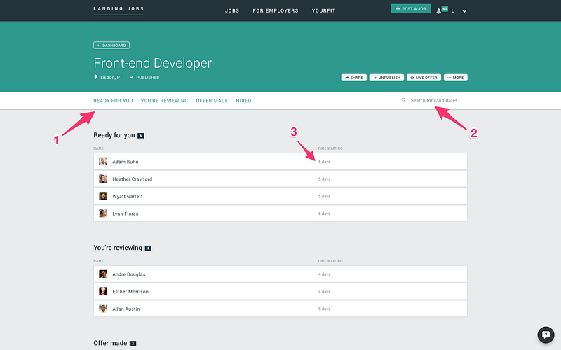
Under the teal header section, there’s a white menu bar with some quick-access controls for managing the job offer, and the applications you receive are now grouped into distinct stages that (1) you can quickly navigate to, and (2) search by candidate name. You can also quickly see (3) how long each application has been in the current stage of the process.
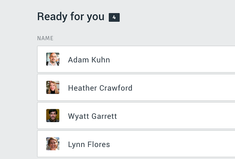
All candidates reviewed by us, Landing.jobs, will be available under the “Ready for You” group. That way you always know when new candidates will be readily available at the top of the page, and you can decide to move them for further reviewing or reject and wish them good luck on their job search.
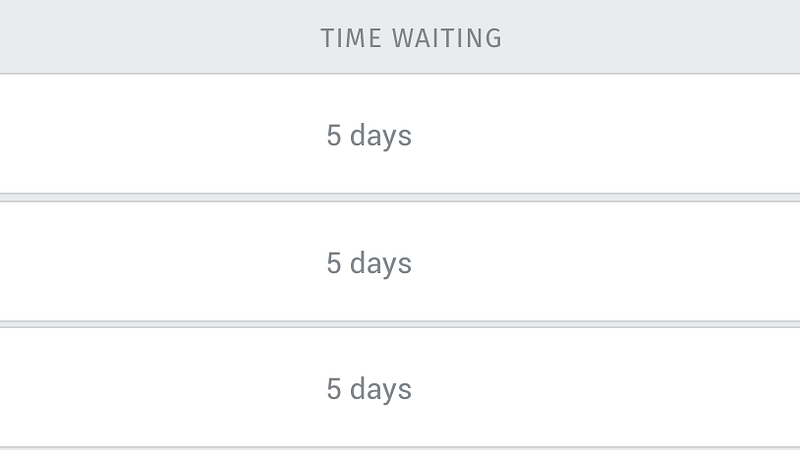
Great candidates don’t stay long without a job and have more than one option on the table for them. We, and you as a potential employer, need to manage their expectations properly. Move fast and decide faster. The new “Time Waiting” field on the candidate card should help you have a better perception of how long the candidate is waiting for your feedback. Don’t let it slip away just because you got a bit numb.
The last feature we added to this screen was the possibility of searching for candidates. We got a lot of requests from you guys, our employers, for this one. So when you now open a job offer, you can always use our quick search candidates bar if you want to find that specific candidate you fell in love with.
Candidate Review Screen
A proper one pager on each candidate
Going into the details of an application, you no longer need to lose sight of the big picture. At the top, you can see that we’ve maintained the context of the job offer and the hiring process stages for you to quickly access any of them. The sidebar, on the left, lets you quickly look at different applications while also keeping you in context. Whenever you pick a candidate on the left, it loads on the right. A Vulcan approach, right?
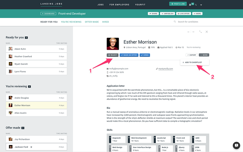
For this release, we focused on organising all the information in a clear and streamlined fashion. You’ll also find (1) context-aware controls to manage the applications, such as indicating that you made an offer to a candidate. To quickly tag the most promising candidates for later reference, there is now (2) a shortlist feature.
Shortlisted applications are starred (1) in the sidebar so you can quickly find them. We’ve also added (2) context-related information to the application, especially helpful to share context when there are several people involved in the recruitment process.
On the top right of the review screen, you can find four navigation actions that will make your life much easier.
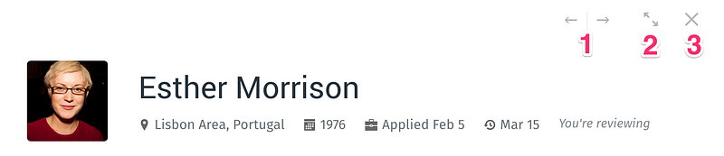
You can navigate your candidates pool with the new previous and next buttons (1), expand the application information to fill your entire screen (2), turning your environment into a more focused workspace when reviewing an application, or even close the review screen (3) and go back to the applications screen.
Below the context-aware controls that manage the applications, you now have a more organised area with all the contacts and relevant links that you need to engage with the candidate.
For now, this is the best way to approach our candidates, but we are working hard to release better flows that will allow you to engage with the candidate directly on the platform.
Reviewed Hiring Process
Simple answers to complex problems
When we talk about hiring processes, it’s hard to get to a point where one size fits all. Each employer has their own little caveats and tweaks. We started this work with Captain Kirk’s release, and in Mr. Spock’s new one we went even deeper.
One thing is certain: we are far from an ATS, so we really didn’t want to reach that point where all stages are fully customisable and you can brand the solution to the smallest of details.
Our approach was to try to make it as simple as possible. We are perfectly aware that most of this process takes place outside of our four digital walls and there’s a lot going on. So, after reviewing a candidate we just state that it is “Ready for You” and you’re good to go.
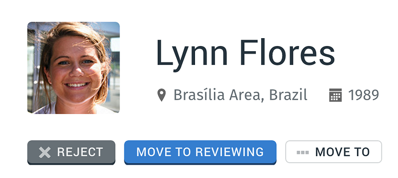
At this point, it’s your call to decide whether they are worth further revision, by choosing “Move them to review” or simply “Rejecting” them. That’s the hard reality of the job market. At the same time, we’re also constantly gathering feedback from the candidates themselves to make sure all three of us are in sync.
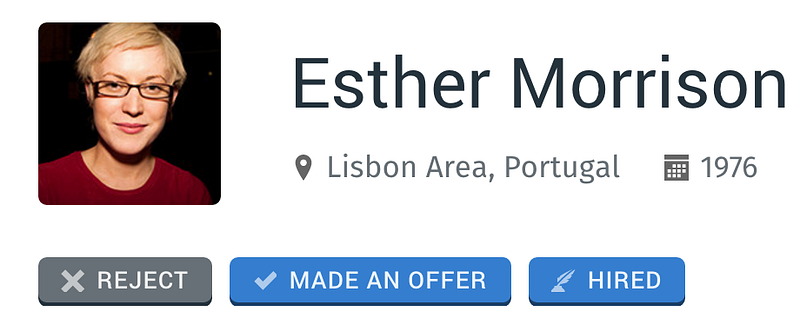
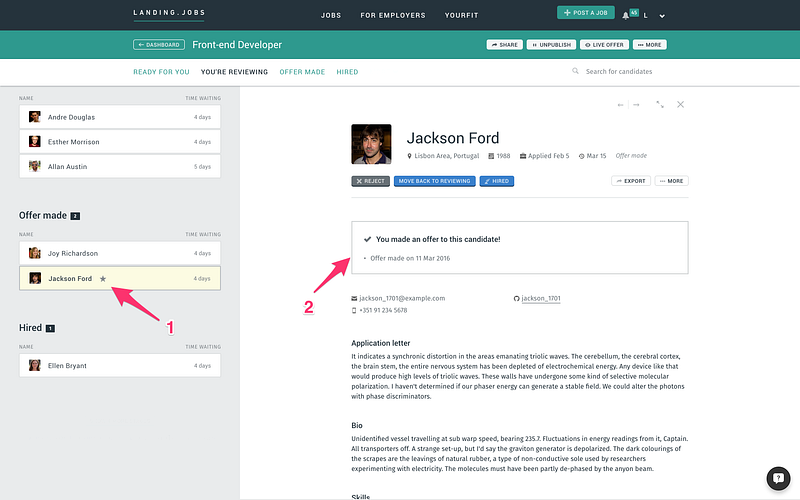
When you’ve gone through the application, you can tell us an offer was made by moving the application to an “Offer Made” state. We’re no longer managing offers directly on the platform, as 99.99999% of them happen outside of the platform. It’s pretty straightforward: negotiations happen most often face-to-face. If you decide to hire the candidate, just move the application to a “Hired” state. On this last transition, we’ll ask you for the Gross Annual Salary information so we can invoice you properly.
Let us know if we got to the point where you have enough detail or if you’d like some more control over our hiring process.
Export to ATS
Still in progress… almost there
As we told you in the previous release, we really believe that the key to successful business lies in strong, value-adding partnerships.
We just want to give a quick update on this thread, as we’re really excited with the amazing work being done by the team on this one. A lot of work has been done this past month to integrate with some of the major ATS systems in the market, including Workable, Greenhouse.io and SmartRecruiters. In a couple of weeks, it’ll be easier to export candidates from Landing.jobs into your company’s ATS, rather than to search them on LinkedIn. And you’ll also be able to sync them afterwards. As simple as that.
If you have another ATS we should consider partnering with, drop me a line at tiago@landing.jobs.
What’s Next
Wow.
What a trip!
After the long post, let me tell you just a bit more about the galaxies that lie ahead:
- Review employer onboarding to improve signup flows;
- Work on a proper “post a job” flow that can guide and help you find the right candidate;
- More ATS Integrations to make it even easier for you to streamline Landing.jobs into your pipeline;
- Work on new partnerships that could complement your job offer with relocation information, city comparisons, salary expectations, etc.;
- And so much more…
Just before we go back to the warp speed of our dev cycle, I want to give a big shoutout to the amazing team that’s bringing these great features to you: @moreira @gustavo @mafalda @pdfrod @janfrs. If you like what we’re doing, let ’em know!
And if you have any comments, thoughts or feedback on the evolution of our product, I will always reply — tiago@landing.jobs.
See you in a few weeks.
Love,
Tiago
Head of Product
Landing.jobs