If you already know Landing.jobs, you know we’re a candidate-driven tech careers marketplace. We’re dedicated to matchmaking great tech talent with great opportunities.
I’m Gabriella and I’m part of the technology team as a UX/UI Designer. We’re a lean team currently composed of 5 Full-stacks, 2 UX/UI designers, 2 Product Owners and one Head. We’re always working in Agile, in 2-week sprints and 2 squads.
Today, I’m here to tell you a little bit about my job and the whole UX journey.
Starting with the basics: what is my job?
“As a UX designer, you’re there to make products and technology usable, enjoyable, and accessible for humans. UX designers tend to work as part of a wider product team, and will often find themselves bridging the gap between the user, the development team, and key business stakeholders.” — Caroline White for Career Foundry
I think this quote explains well what our job is about. We are champions for users and the business, finding a balance between both so that users’ experience navigating our platform is smooth, answering to their needs, and simultaneously serves the main purposes of our business. And if you want to dig a little deeper into this profession before moving on, this video sums it up in a nice way.
One of my daily challenges is to increasingly improve Landing.Jobs users’ experience, making it easier and more effective. For a UX designer, users’ feedback is extremely important. We analyse and prioritize every feedback we receive, aligning them with our OKRs and turning them into initiatives. Being a tech careers marketplace, our main users are naturally Talent (candidates) and Companies.
Getting to the heart of the problem
The first step in the UX design journey is identifying the problem, and this is usually made possible thanks to the feedback we receive. Today I’m using one specific issue we recently tackled to explain the whole journey.
First of all, it’s important to give a little background on how our platform works. Since we’re a “matchmaking” platform for companies and candidates, both can create accounts there and manage their job postings and job applications, respectively.
So, at one point we were receiving the same feedback from several companies: they were getting notified every time another team member performed an action on the platform. This created too much noise and got in the way of their main objective: following and receiving notifications only for job applications of interest. That was our starting point.

Scope of the project (mapping and finding the focus point)
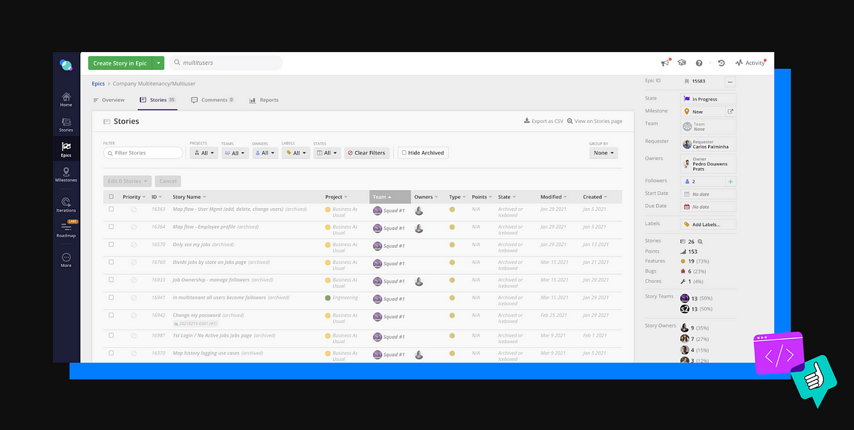
Because we have a certain timeframe and budget for each initiative, the first thing we do is to map the flows and identify where it would have the biggest impact on users’ experience, pointing out the critical spots.
We came to the conclusion that the main focus would be to allow every company to have several profiles inside a team in the platform, which would guarantee that users would have unique actions associated with their profiles. This would allow users to manage notification settings and activate them only on targeted actions.
However tempting it is to make many improvements, focusing on the main issue and guaranteeing that it doesn’t break the user’s flow in any point is key to being effective and is already ambitious in itself.
Getting actionable: how I get started with UX development
From the style guide, I started by designing tables and new flows that answered to the new needs. I came up with these different user needs in the platform:
- The ability for each team member to have a unique profile
- The ability to manage each team member
- The ability to track job applications
- The ability to manage job applications, enabling users to follow and unfollow certain job apps
We came up with action points and proposals that were then discussed in the squad. When we reached a solution that answered the problem, we presented and validated it with the users.

The moment of truth: Usability Testing

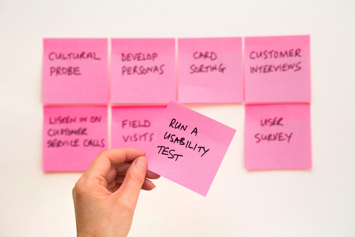
The usability test serves to observe a product’s use and investigate the issues that involve navigation and understanding of the interface. In other words, it validates usability issues.
The goal of the usability testing in this case was to evaluate the usability of the job application management processes in the platform, in order to find possible interaction problems that might arise. It was carried out with users whose profile matched with employee recruitment, as well as with job vacancy sites and apps. During this step of the process, the tests are always recorded during their executions and we take notes about relevant considerations.
Analysing the results
After the tests, we reviewed the recordings and considered the comments and main challenges observed during the performance of tasks in the test. It’s from there that we come up with improvement proposals and prioritize them by user impact.
At this point, the team is still developing so we’re able to implement small improvements in real time. They might be small, but these represent the little changes that make users’ life easier, which is the whole point of our job.
Taking note of the next steps
We took note of the improvements that we could validate again or observe after implementation, things in which we identified some fragility but that we knew would not prevent the user from completing their tasks/achieving their goals.
At this point, there were also some other improvements to implement, but they were to be reevaluated along the way, with the help of users’ feedback in using the feature.
My advice to fellow aspiring UX designers
One important thing I learned in the journey as a UX was to let go of preconceived ideas. The most essential part of my job is to involve my team in my work, have the maturity to pick the methodology according to each project’s and feature’s needs, and apply it in the most imparcial way possible.
If I had to give some advice to other fellow UX designers or aspiring ones, it would be to pay attention to the feedback that doesn’t explain the problem but already presents a solution — oftentimes it’s a trap for the end result. Don’t go for “influential” feedback. The best way to gather valuable information for your job is to observe the actions of users that are performing their day-to-day tasks and gather information from their behaviour.
Finally, I’d say that learning is a continuous process and it doesn’t end when you reach 5, 10, 20 years of experience in the field. You may gain more astuteness as you go along, but you never stop learning from users. So always pay attention to them, they are the main piece in the chess board 🙂
We actually have some UX positions currently open on the platform -so if you’re on the look out for a new job in this area, take a peek!
